What is Minimalism Style?
Minimalism can be defined as: the feeling of perfection exuded when the content of a work is reduced to a minimum. An object possesses this characteristic when all its components, all its details, and all its connections are reduced to its essence. This is the result of removing non-essential elements.
Today we can see the shadow of minimalism style in architecture, art, photography, literature, music, UI design and even food.
Why is minimalism so popular?
Why is minimalism so popular? First of all, it is because it is consistent with the current spirit of democracy and equality. In an era when the amount of information is extremely small, the form of information can be very complicated without causing excessive cognitive load. But in today’s democratized era of large amounts of information, the formality of complicated formality only makes people feel solemn and ridiculous. And after the baptism of modernism, everyone generally agrees with the view that “useless things don’t need to exist.”
In fact, minimalism style has never really caught on. Popular are minimalist and modernist styles. The design style represented by Apple style is simple rather than minimalist. Please note that minimalist style and modernist style are two different things.
Historically, it was modernist-style design that was popular on a large scale, rather than minimalism. Minimalism is, in a sense, a more extreme manifestation of modernism. Overly radical designs are almost stripped of human nature or extreme emotions. Because such an approach is very extreme and sharp, it cannot withstand practical life. Nor can it carry the rich emotional needs of life. Therefore, minimalist works can only exist as art or conceptual expression, and it is difficult and almost never popular on a large scale.
Minimalism often emphasizes the existence of more extreme declarations, and is very harsh. This is an obvious difference from modernism. But essentially, what is very similar to modernism is that both strip away or oppose human nature. Minimalism is more of a subtraction on the basis of modernism, so it is more harsh and sharper than modernism. Apple’s design contains emotion and wisdom. To a certain extent, Apple’s design is more like “Western Zen”. Humanized design and values refined through reflection and emotion are exactly the core of Apple. Therefore, the design style represented by Apple is not as simple as just subtraction, so it cannot be said that the popularity of Apple style is equal to the popularity of minimalism.
Less is More: The Beauty of Simplicity
Like the famous architectural designer Dieter Rams’ design concept of “Less, but better”, the core design concept of minimalist design is also to bring people a better sense of use through simple design, that is, Simple but meaningful.
In order to do this, minimalism requires not just simplification and elimination of elements, but precision and function. Therefore, beneath the simple surface of minimalist design, there is a complex design process hidden.
Characteristics of Minimalism Style
- Usually what we refer to as “minimalism” includes the following characteristics:
- Simple
- clear
- clear visual hierarchy
- High contrast components and proportions
- Every element has a function
- Lots of space and white space
- High attention to core details
- Typography is an important design element
- Non-functional decorative elements are removed
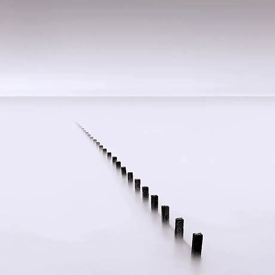
In the following text, we will elaborate on several important factors in creating minimalism style.
-
Clean Lines
We can often see simple and clean lines in minimalist design. This kind of design is most commonly seen in architecture, interior design and graphic design, and is closer to our lives in furniture and fashion. The designers used just a few lines to build the overall framework, creating a sense of clarity and order.
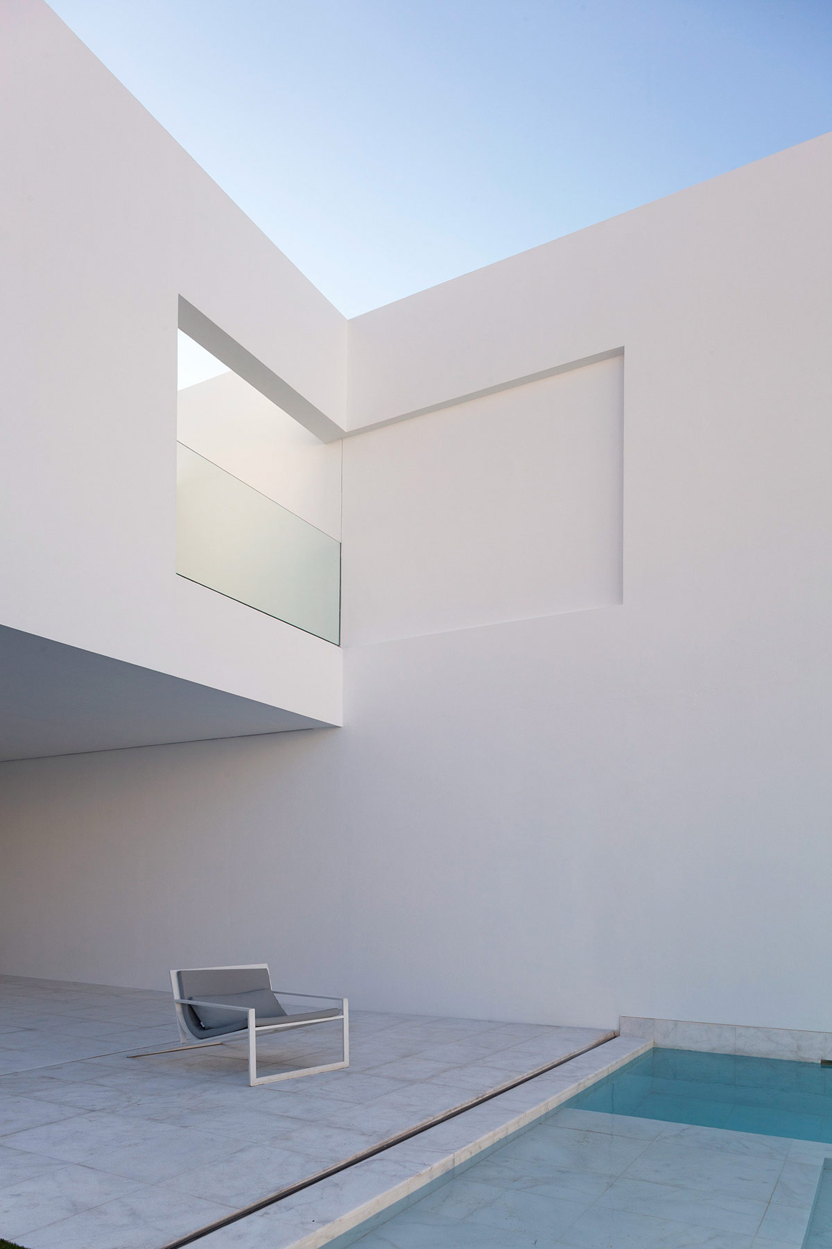
Clean Lines
-
Neutral Colors
Black, white and gray may be the three primary colors of minimalism!
Neutral colors are crucial in minimalism style. Starting from the psychology of color, neutral colors such as white and beige can more easily create a calm and cold atmosphere.
While neutral colors are a great way to create a minimalist style, that doesn’t mean minimalism is limited to these colors. Perhaps exploring how to better combine popular colors is also a major topic in the development of minimalism.
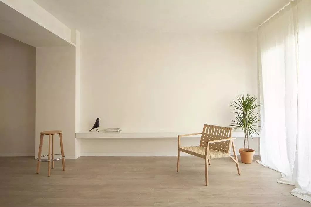
Neutral Colors
-
Creating Uncluttered Spaces
We mentioned declutter in the last article. The spatiality of minimalism also does not mean emptiness and blankness, but focuses people’s attention on existing elements.
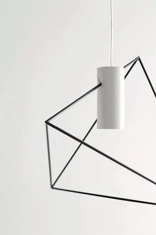
Creating Uncluttered Spaces
-
Minimalism and flat design style
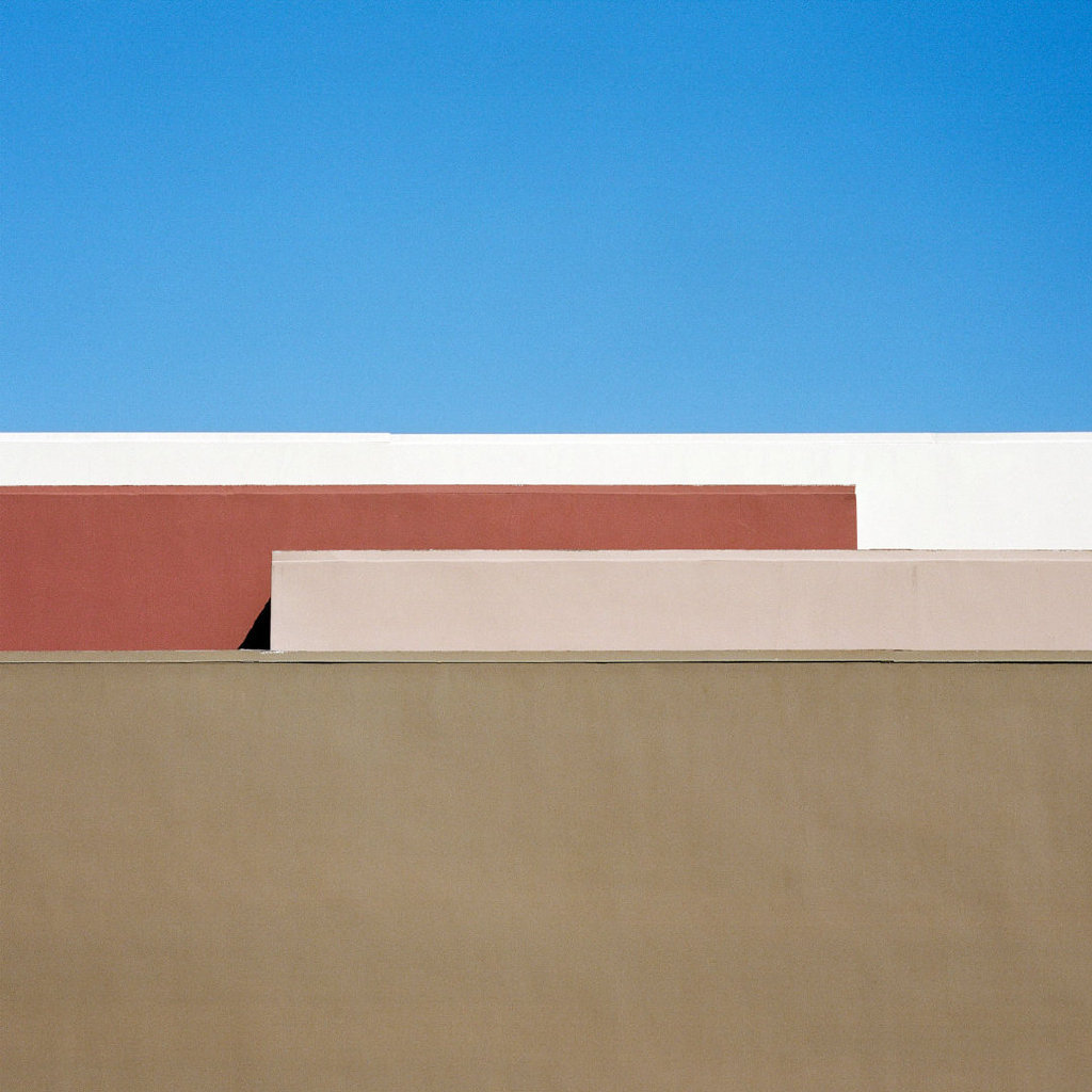
The trend of flat design and minimalism are complementary to each other, and the two maintain a high degree of consistency in technical details and spirit. As we all know, flat design removes the highlights, shadows, gradients and textures that are widely present in skeuomorphic design, while flat design 2.0 only adds a little shadow and subtle gradients to a limited extent.
PS: Flatness is more of a technical technique and style, while minimalism has a broader meaning. It includes a set of strategies for layout, composition, color matching, contrast and even the overall design spirit. Therefore, flatness Personalized design should be regarded more as a technology and design technique for creating minimalist design.
Minimalism and flat design style
-
Use simple fonts
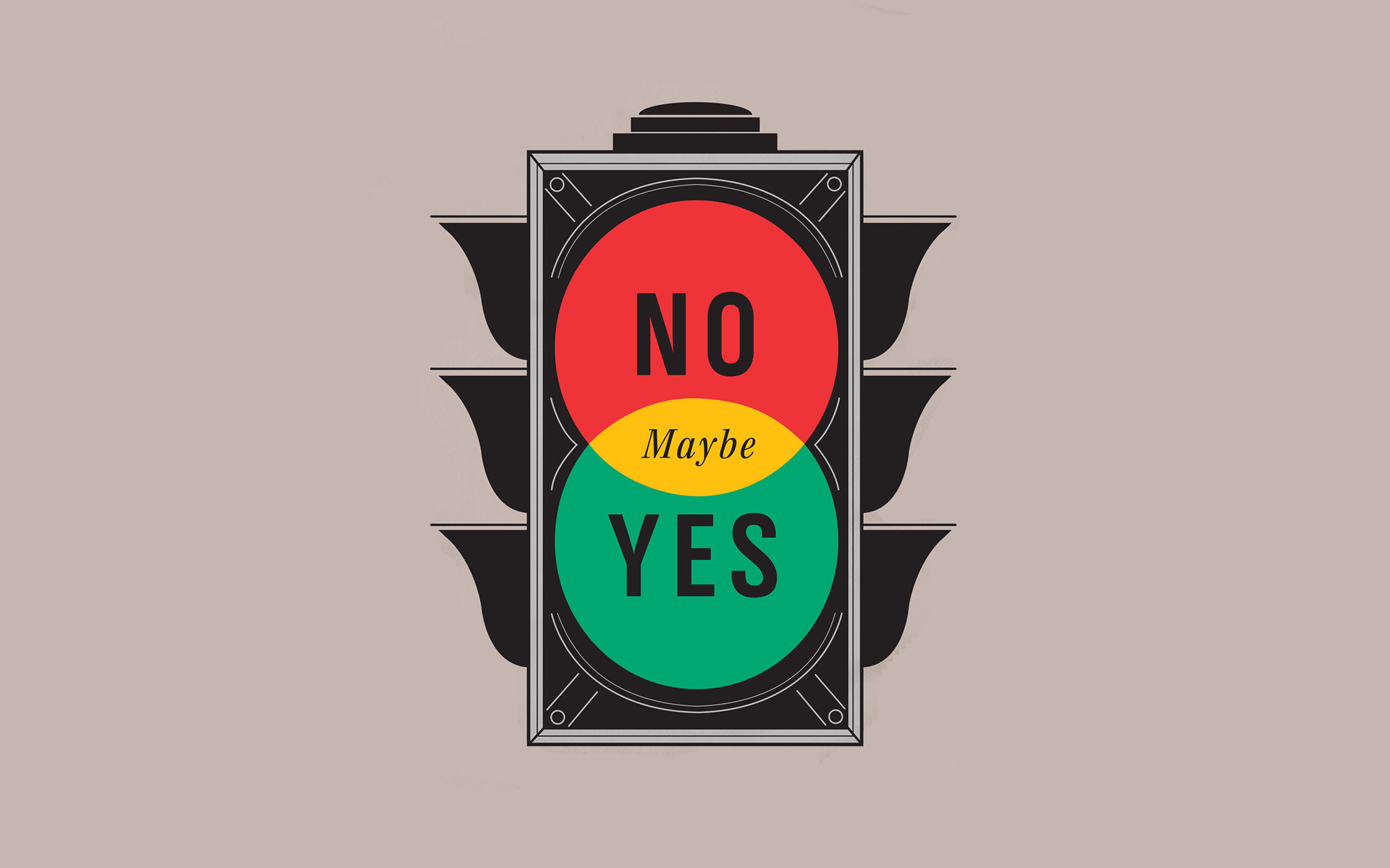
If you need to use text in your design, a clear and intuitive font, such as a sans serif font, is usually the best choice. For brand identity, a simple style trademark is very practical. The logo graphics and colors adopt a minimalist style and are perfectly integrated with other extended elements and products to create a holistic sense that makes the brand image very easy to remember.
Use simple fonts
In this article we have briefly discussed the elements and characteristics of minimalism style, you can create your own freehand based on these, hope it can help you. In the next article we’ll talk about the specific manifestations of minimalism style, so stay tuned~!


